Height difference is not always easy to judge with numbers alone. A few centimeters can change how two people look side by side. Most people try to guess the gap, but the result often feels unclear or wrong.
A height comparison gives a clear answer without confusion. It shows the exact difference on a visual chart. You can see how tall each person looks in real scale. The result appears in both CM and feet, so it fits every user. This makes the process quick, simple, and easy to trust.
Height Comparison in Simple Terms
Height comparison is a simple idea. It shows the difference between two or more people. It uses exact numbers and a visual display. This helps you understand the gap in a clear way.
Many people compare height in daily life. Friends do it for fun. Fans compare celebrities. Some people use it to check average height. A visual method gives better clarity than plain numbers.
When you compare heights visually, you do not rely on text only. You see real scale. This makes the result easier to trust. It also feels more real and engaging.
Visual Chart Makes It Clear
A visual chart solves most problems. Numbers alone can confuse users. A chart shows height in a clean and simple format. You can see who is taller at a glance.
Each person appears on a scale. The chart aligns them side by side. The difference becomes easy to notice. Even a small gap shows clearly.
This method works well for:
- Friends and family
- Celebrity comparisons
- Personal curiosity
A reliable height comparison uses proper scaling and correct proportions, which helps show a more accurate and realistic result.
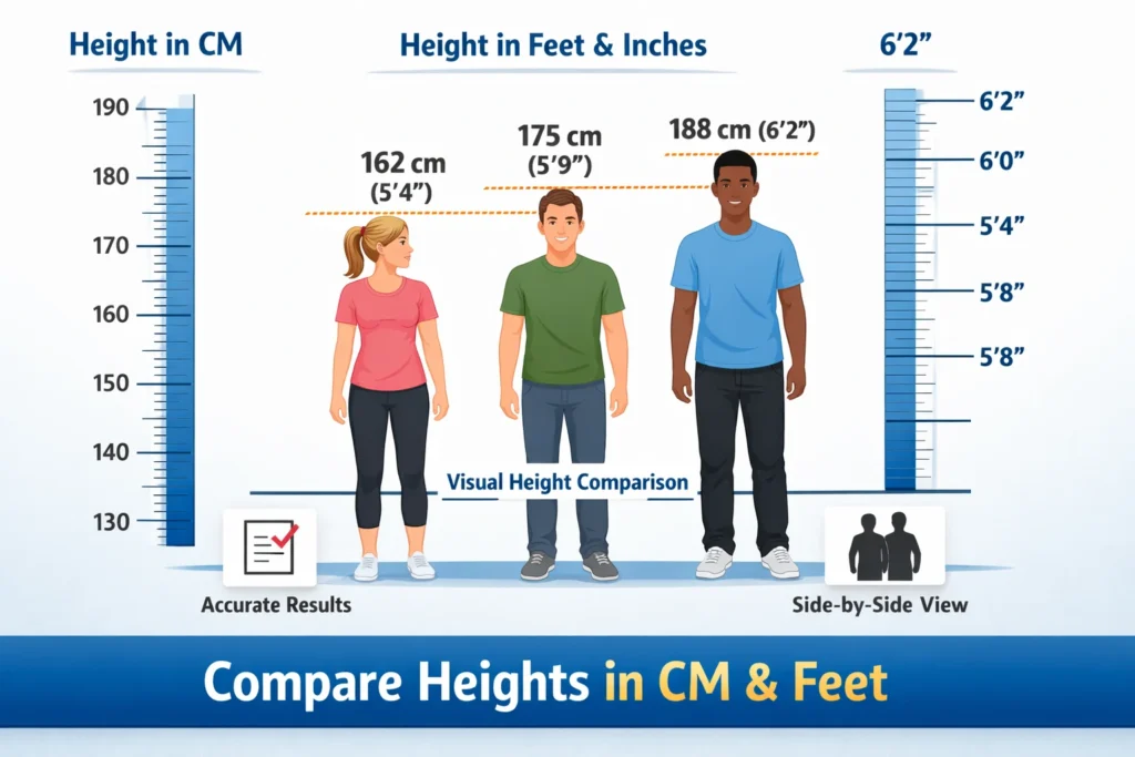
CM vs Feet Difference Explained
People use two main units. One is centimeters. The other is feet and inches. Both show the same height in different ways.
CM is simple and exact. It uses one unit. It works well for calculations. Many countries use this system.
Feet and inches feel more familiar to some users. It breaks height into two parts. This can feel easier to understand in daily life.
Here is a quick example:
- 170 cm = about 5 feet 7 inches
- 180 cm = about 5 feet 11 inches
A good height comparison should support both formats. This helps users from different regions. It also avoids confusion.
Real Examples of Height Difference
Real examples help you understand better. Imagine two people:
Person A: 170 cm
Person B: 180 cm
The difference is 10 cm. On paper, this looks small. On a visual chart, the gap looks clear. Person B appears taller in a noticeable way.
Now think about a celebrity example:
- Lionel Messi: about 170 cm
- Cristiano Ronaldo: about 187 cm
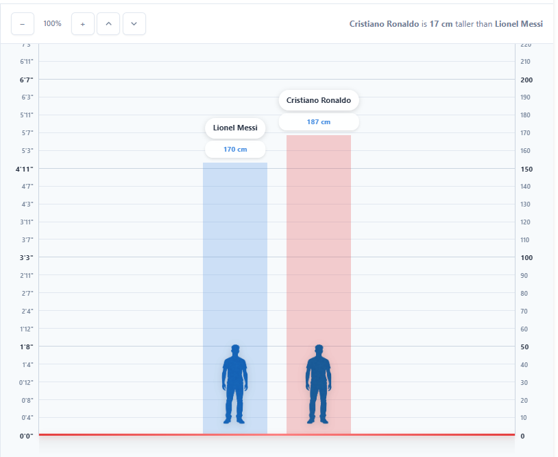
The gap is large. A visual comparison shows a strong difference. This makes it easy to understand without calculation.
These examples show why visual tools matter. They turn numbers into something you can see.
Height can look very different from what numbers suggest. A small difference on paper can appear larger or smaller in real view. A visual comparison helps you see this clearly without confusion. It shows how two or more people stand next to each other in real scale. This makes it easier to understand the gap and avoid wrong guesses. It also helps when you compare friends, celebrities, or average height. A clear view gives better judgment and more confidence in the result.
How accurate is height comparison?
Accuracy depends on correct height input and proper scaling. A good visual chart uses exact values, which helps show the real difference in a clear way.
Can more than two people be compared at the same time?
Most modern tools support multiple entries. This makes it easier to view several people side by side and understand the gap without confusion.
Which unit works better for comparison, CM or feet?
Centimeters give precise values and work well for exact checks. Feet and inches feel more familiar in daily use. A tool that supports both formats gives better flexibility.
Why does a small height difference look bigger on a chart?
A visual chart shows real scale instead of plain numbers. Even a small gap can look more noticeable when two people appear side by side.
What is the best way to compare height correctly?
Correct input and a proper visual chart give the best result. This helps remove guesswork and shows the difference in a simple and reliable format.
Height can look very different from what numbers suggest. A small gap may seem minor on paper, yet it can appear more noticeable in real view. A visual comparison helps show this difference clearly without guesswork.
When you place people side by side on a proper scale, the result becomes easier to understand. This helps you see how height actually looks in real situations, not just as numbers. It also improves clarity when you compare friends, celebrities, or average height.
A clear and well-scaled height comparison gives a more reliable view. It turns simple data into something you can see and understand quickly. This makes the result more practical, more accurate, and easier to trust.